Visual identity
Garden Inn Condomínio
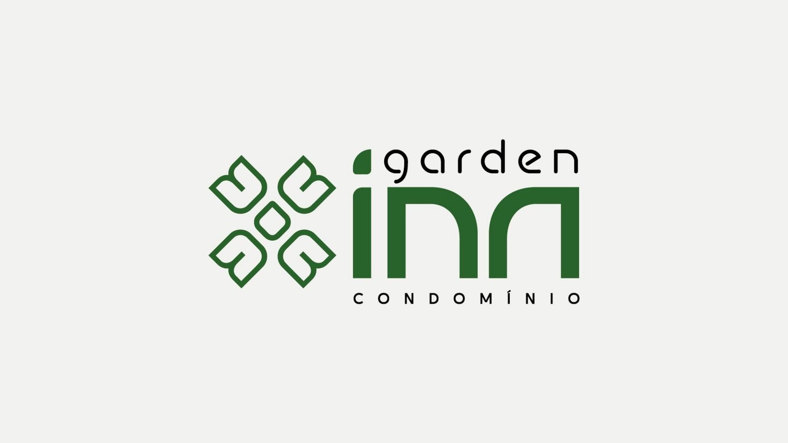
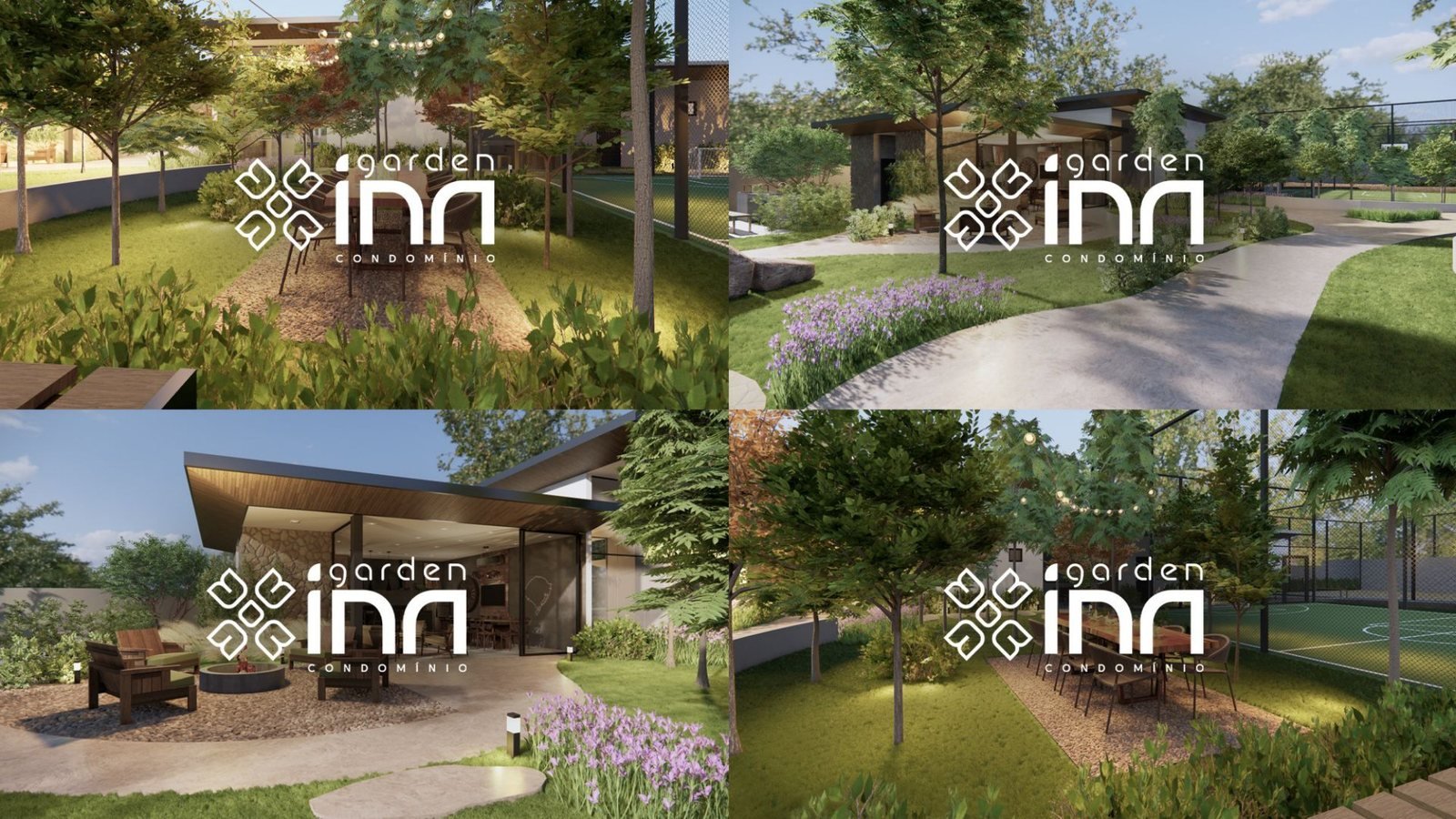
Brand for the Garden Inn residential community: four letters N that turn into leaves, in green and black, from construction hoardings to sales materials.

Brand colours
- #236432
- #231F20
- #FFFFFF
The project
A residential community by Incoben that needed a brand connected to nature and family life, strong enough for construction hoardings and elegant in sales materials.
What we did
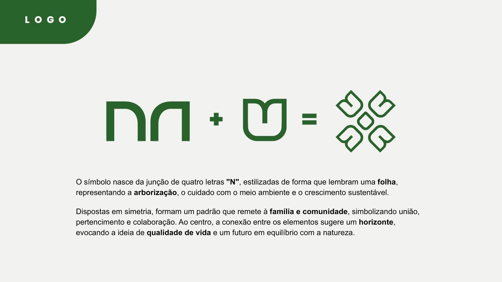
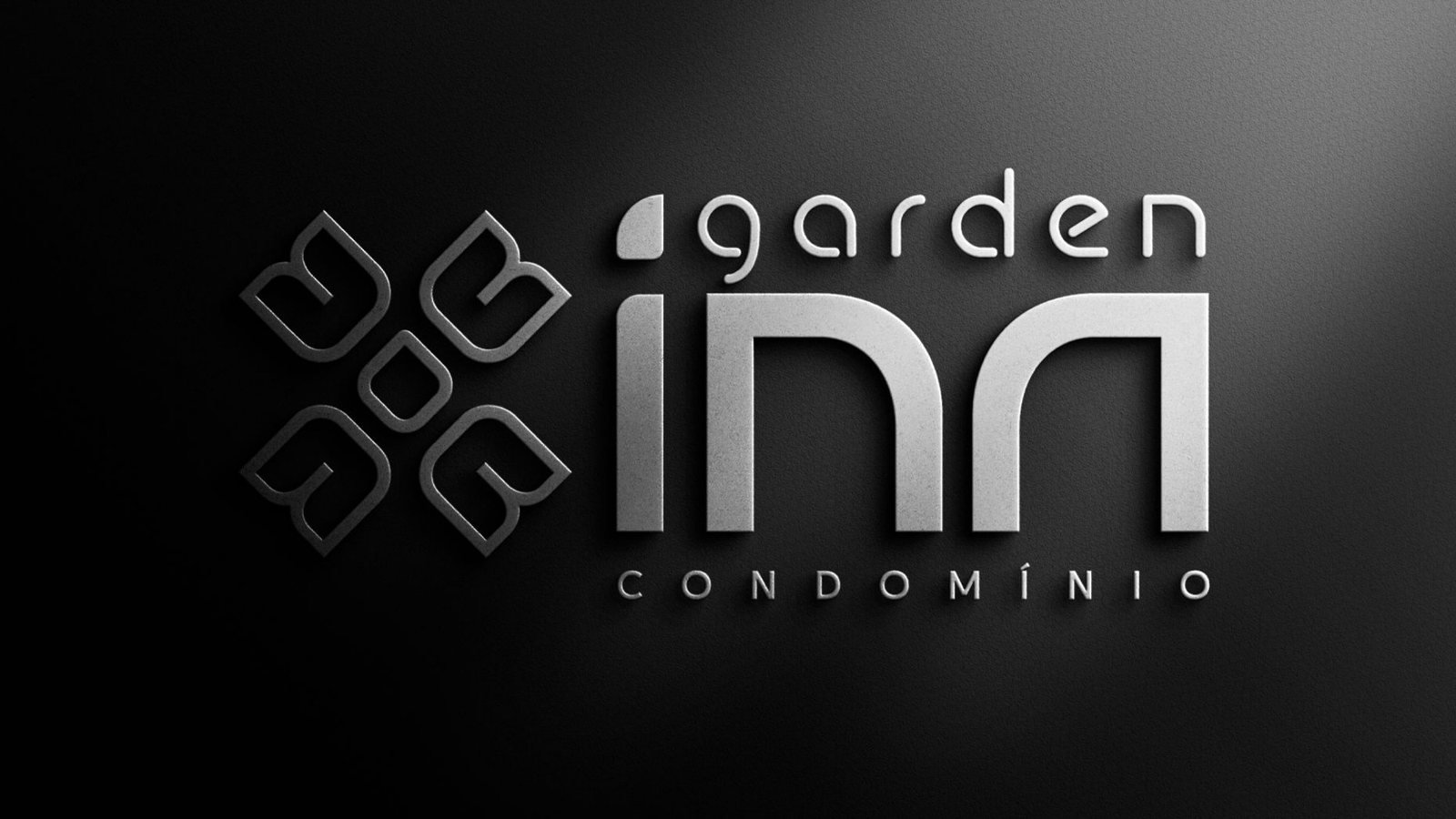
- A symbol made of four letters N stylised as leaves. In symmetry, they evoke family and community, and the point where they meet in the centre suggests a horizon.
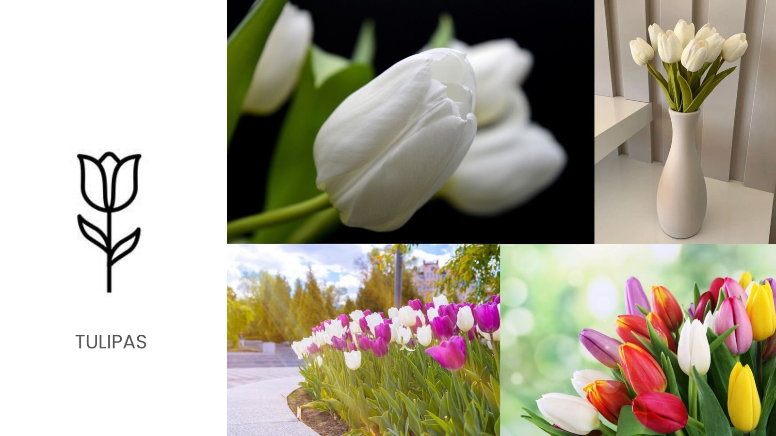
- Inspiration from tulips, a green and black palette and a combination of three typefaces: Rebellion, Glorion and Altone.
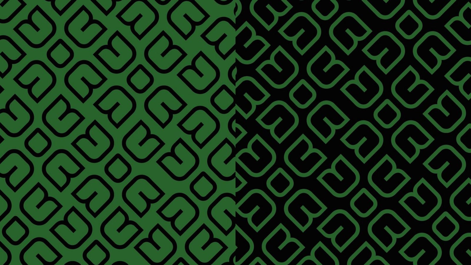
- Versions for light, dark and green backgrounds, a graphic pattern made from the symbol and slogan suggestions.
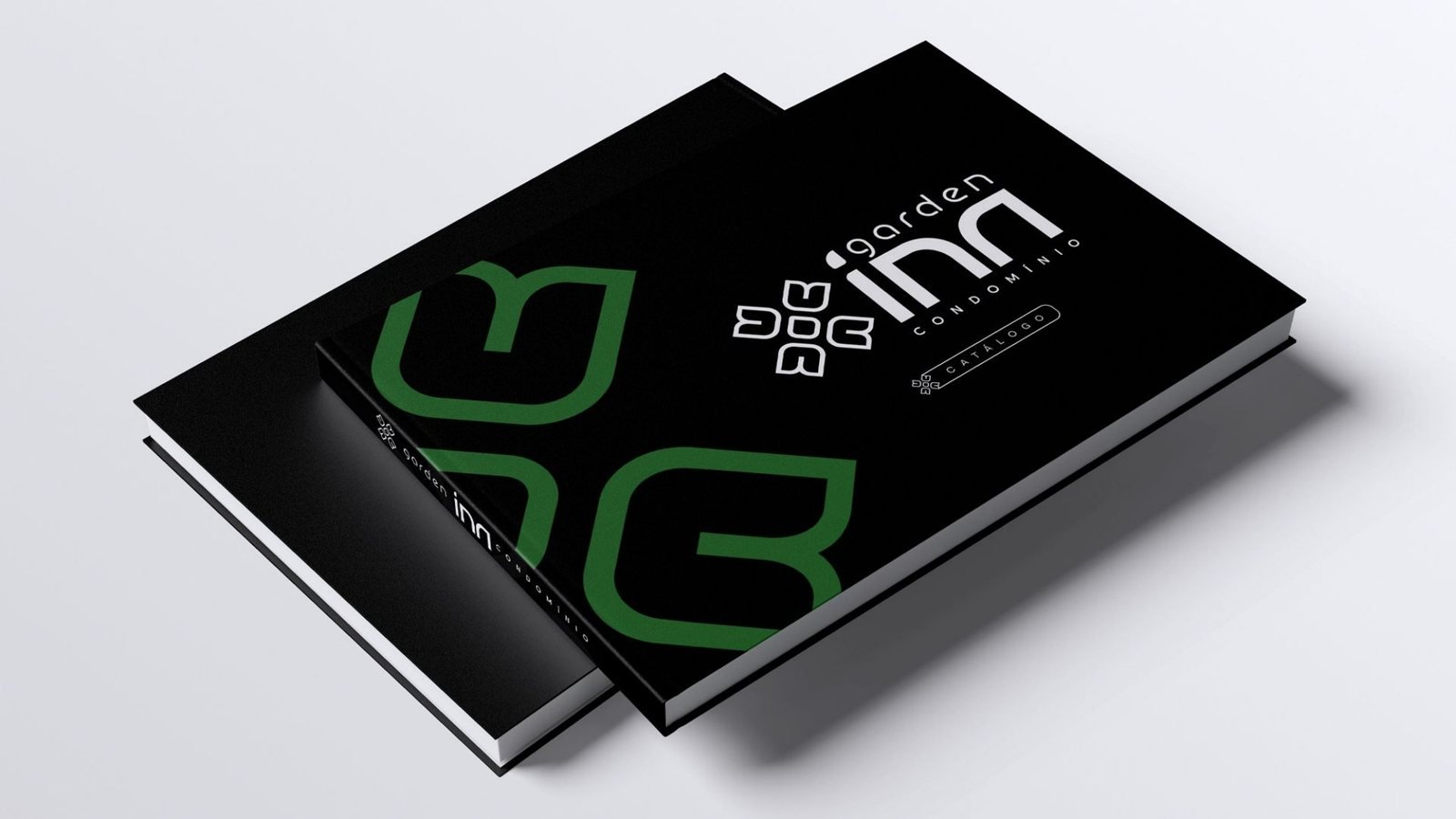
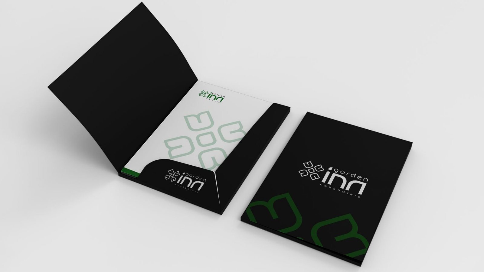
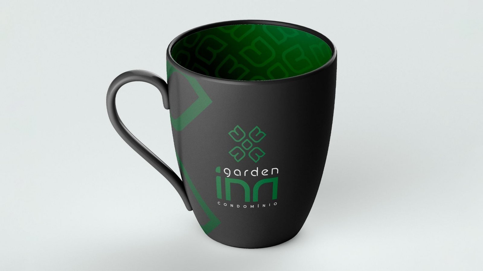
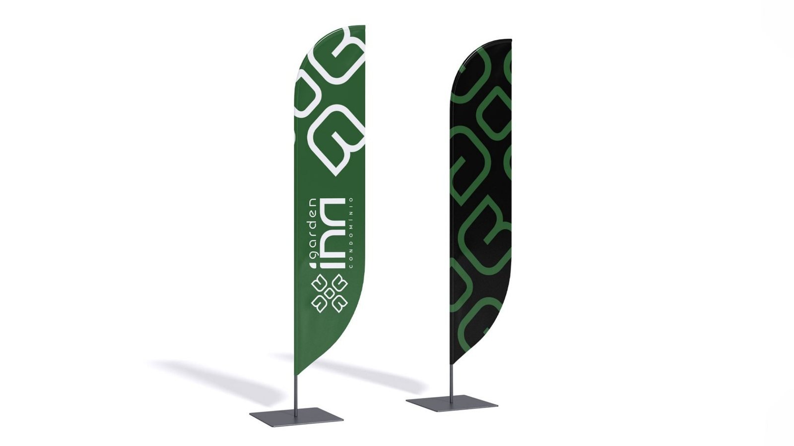
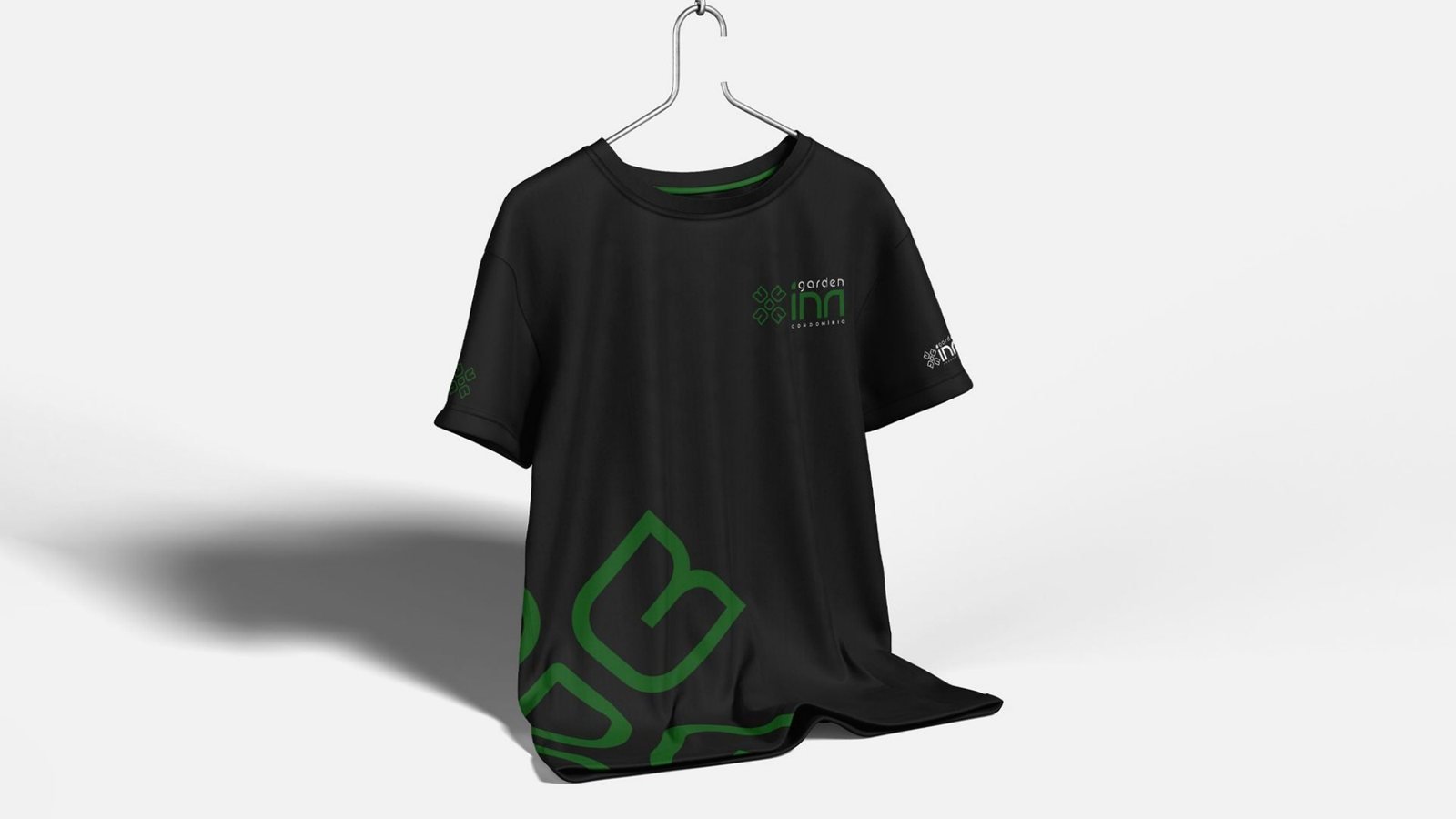
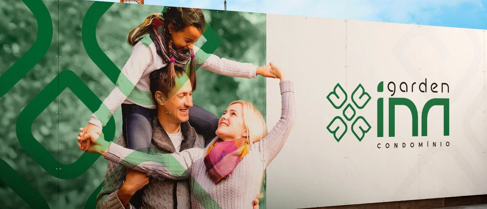
- Applications on hoardings, folders, notebooks, mugs, T-shirts, flags and planters for the sales centre.
The brand in use
More case studies
View all in identidade visual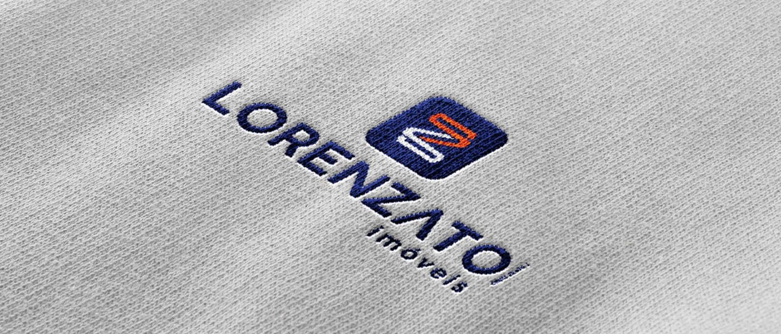
Real Estate
Lorenzato Imóveis
A new brand for the real estate firm: a symbol built from the letter Z in a continuous line, in blue and orange.

Agribusiness
Alfa Nano Brazil
Nanotechnology for agriculture: an alpha symbol in green with yellow lines that connect farming and technology.

Agribusiness
Tratos Leilão de Máquinas
A brand for a heavy machinery auction company in high-contrast green and orange, designed for billboards, trade shows and uniforms.